A 16:9 tile image and headline within the My Hub Offers page

My Hub Offer Overview

Offer Tile
Dimensions Min 352px x 198px, Max 880px x 495px
Maximum File Size 500 KB
File Type JPG, PNG (no transparency)

Offer Headline
Headline Character Count 65 characters, including spaces

Requirements and Recommendations
Pricing Format Pricing must be listed in the format of $X.XX/mo. wherever possible in both tile artwork and headline copy.

Example: for $11.99/mo.
Example: $.99/mo.
Abbreviations Use shortened abbreviations to help with legibility and simplicity.

Example: "1st" instead of first
Example: "mo." instead of month
Example: "mos." instead of months
Offer Headline Text Format Headlines should use title case
NOT Permitted
  • Promo codes
  • QR codes
  • Adding a black background
  • Using a gradient with black that that extends to the edges - a clearly-defined tile edge is required
  • Adding solid color or gradient borders around the tile artwork
  • Adding CTA buttons in the title image
Avoid
  • Adding disclaimer text unless legally required or include abbreviated mention "terms apply". Full offer disclaimers may be included on the following screen
  • Using excessive text/logos - messaging should be clear and legible
  • Heavy offer messaging - For the best readability and television user experience, keep offer messaging in the tile itself to a minimum. Instead, prioritize showcasing your app's brand identity and compelling visuals that spark interest. Tout offer details within headline text.
  • For primary messaging, avoid anything smaller than 16px as text risks legibility from 10-ft and beyond viewing
  • Tax messaging unless legally required
Recommended
  • Apply a strikethrough to the regular price where included
  • When promoting extended trials, clearly highlight the duration using words like "extended," "longer," or "additional" to describe the trial period

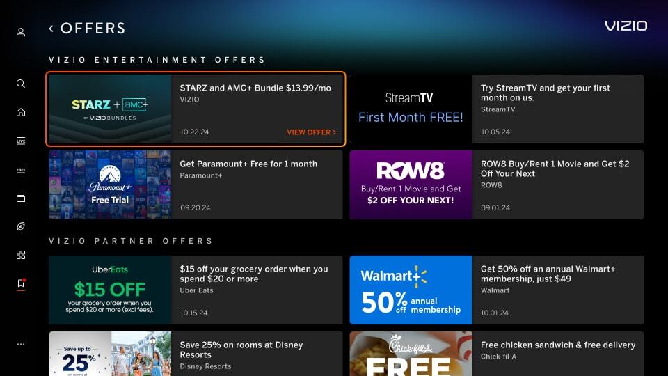
Mimic Platform UI: Border
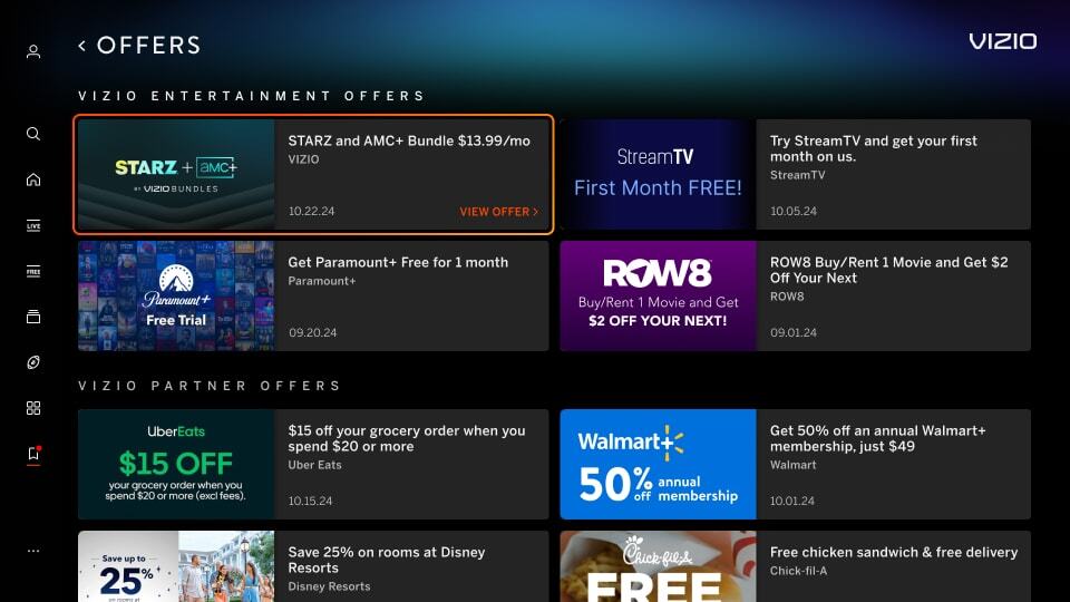
Image has a border around the artwork which can mimic a focus state causing confusion for the user. See the top right tile in the example below.

Incorrect Example  ✘

Correct Example  Green Check Mark

Incorrect - Discover Tile - Border Correct- Discover Tile - Border


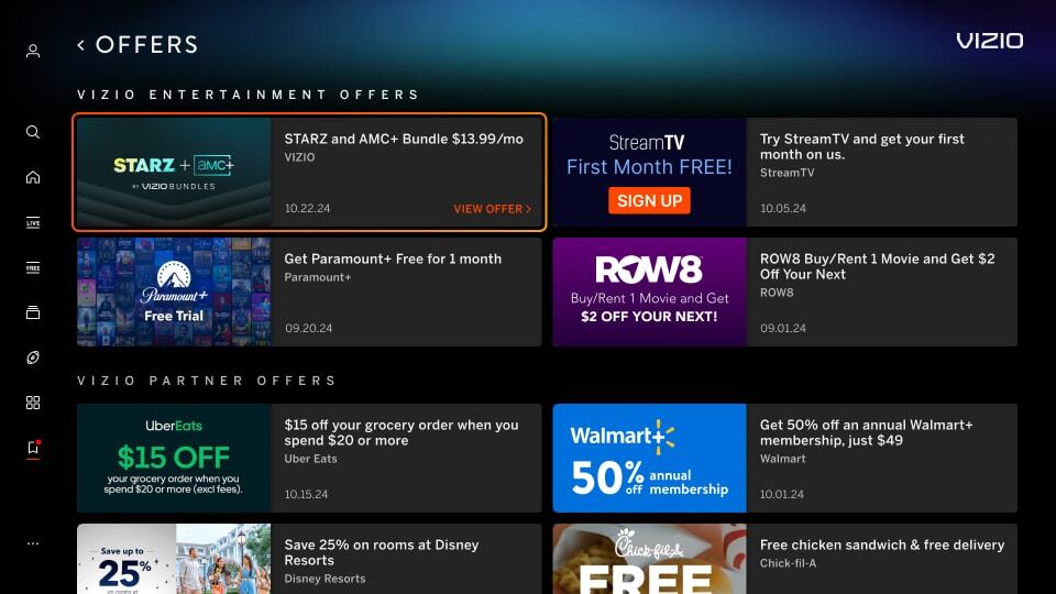
Mimic Platform UI: CTA Button
Image has a CTA button in the tile image which can cause consistency issues with our platform and can be confusing for the user. See the top right tile in the example below.

Incorrect Example  ✘

Correct Example  Green Check Mark

Incorrect - Discover Tile - CTA Correct- Discover Tile - CTA


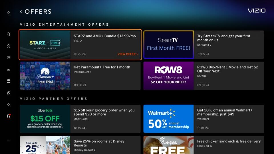
Mimic Platform UI: Solid Black Background
Image uses a solid black background which makes content blend with VIZIO UI. See the top right tile in the example below.

Incorrect Example  ✘

Correct Example  Green Check Mark

Incorrect - Discover Tile - Black BG Correct- Discover Tile - Black BG


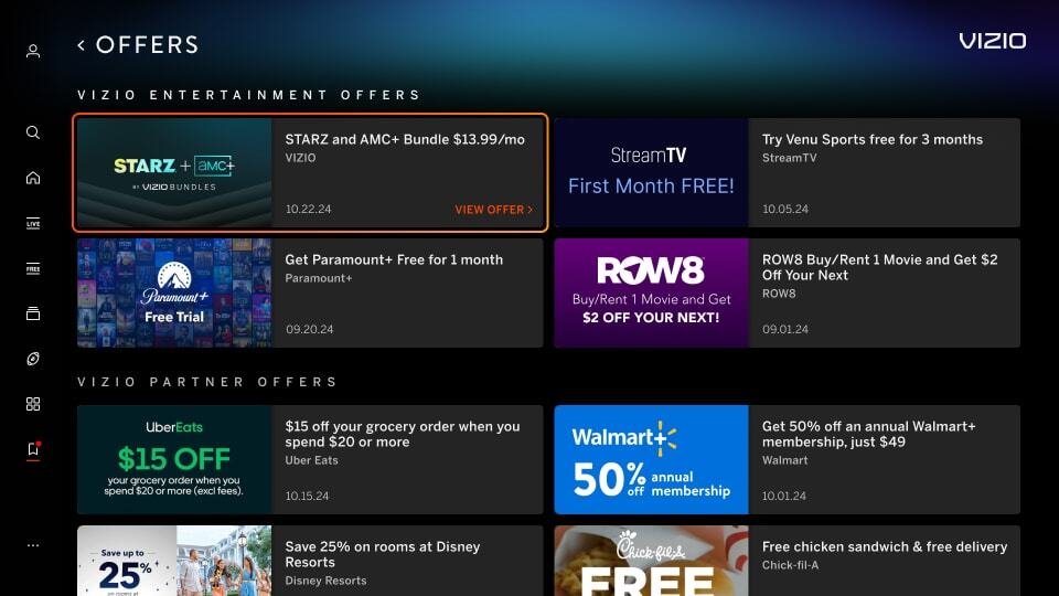
Black Gradient in Background
Image uses a gradient that extends to the edges of the tile in black, which makes the tile's defined edges blur into the black background. See the top right tile in the example below.

Incorrect Example  ✘

Correct Example  Green Check Mark

Incorrect - Offer Tile - Gradient Correct- Offer Tile - Gradient